When it comes to interior design, color plays a crucial role in setting the tone and creating the desired atmosphere within a space. The psychological effects of colors can significantly impact our mood, emotions, and overall well-being. Understanding how different colors influence our psyche can help create harmonious and inviting living environments that resonate with our personal preferences and lifestyles.
The Power of Warm Colors
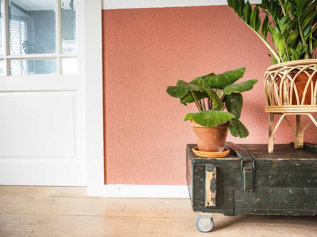
Warm colors such as red, orange, and yellow are known for their stimulating and energizing effects. Red, for instance, is often associated with passion, energy, and warmth. It can create a sense of excitement and intensity in a room, making it an ideal choice for spaces where social interaction and liveliness are desired. A bright red accent wall can energize a dining area, encouraging conversation and stimulating appetite.
Orange, a combination of red and yellow, brings a cheerful vibe, making it perfect for family rooms or play areas. It invokes feelings of enthusiasm and creativity, encouraging interaction and engagement. Yellow, the color of sunshine, is known to uplift spirits and can create a joyful atmosphere. However, it’s important to use it wisely; too much yellow can lead to feelings of agitation.
Incorporating warm colors doesn’t have to mean overwhelming a space. Instead, consider using them in smaller doses, such as in accessories, artwork, or furniture. This approach allows you to enjoy the benefits of these colors without overstimulating the senses.
Invoking Serenity with Cool Colors
In contrast to warm colors, cool colors like blue, green, and purple have a calming and soothing effect on our minds. Blue, often associated with tranquility and peace, is commonly used in bedrooms and living rooms to promote relaxation. Light blues can create an airy and open feel, while deeper blues can evoke feelings of stability and security.
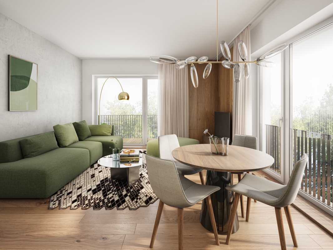
Green, the color of nature, embodies balance and harmony. It has been shown to reduce stress and promote feelings of well-being. Integrating green into your home, whether through plants, wall colors, or decorative elements, can help create a tranquil environment that enhances mental clarity.
Purple, particularly in softer shades, can inspire creativity and a sense of luxury. Using lavender or lilac in a workspace or reading nook can promote both relaxation and inspiration, making it an excellent choice for areas intended for focus and creativity.
The Impact of Neutrals
Neutrals such as white, gray, and beige serve as excellent base colors in interior design. They provide a versatile backdrop for other bolder hues and can help create a sense of balance and sophistication in a room. White, in particular, symbolizes purity and freshness, making it a popular choice for minimalist and modern interiors. It can make spaces feel larger and more open, which is especially beneficial in smaller homes.
Gray is a versatile neutral that can range from warm to cool tones, making it adaptable to various design styles. A warm gray can create a cozy atmosphere, while a cooler gray can lend a contemporary feel. Beige adds warmth and earthiness to a space, offering a sense of comfort.
Using neutrals effectively can enhance the overall aesthetic of your home, allowing you to layer in other colors through furniture, art, and textiles without overwhelming the space. They can also provide a calming effect, making them suitable for any room where relaxation is a priority.
Creating Contrast with Bold Colors
Bold colors like black, deep purple, and vibrant yellow can add drama and personality to a space when used strategically. Black, often associated with elegance and power, can create a sense of sophistication and mystery. It can be used to create focal points, such as an accent wall or statement furniture pieces.
Deep purple evokes luxury and creativity, making it suitable for spaces where inspiration is key, like a home office or artistic studio. It can create a cozy, intimate atmosphere when used in moderation. Meanwhile, vibrant yellow adds energy and cheerfulness, ideal for areas like kitchens or entryways where a welcoming vibe is essential.
The key to using bold colors effectively lies in balance. Combining bold hues with neutrals can help maintain a sense of harmony, preventing a space from feeling chaotic. For instance, a bold navy blue sofa paired with neutral-colored walls and light-colored accessories can create a striking yet inviting environment.
Balancing Colors for Optimal Effect
When designing a space, it’s essential to find the right balance of colors to create a harmonious and visually appealing environment. Using a combination of warm, cool, neutral, and bold colors can help achieve a well-rounded design that caters to different moods and functions within a space.
Consider using the 60-30-10 rule, which suggests that 60% of a room should be a dominant color, 30% a secondary color, and 10% an accent color. This strategy helps create a cohesive look while allowing for personality and flair through accent pieces.
Don’t be afraid to experiment with color samples in your space before committing. Lighting can dramatically change how a color appears, so observing how different hues interact with natural and artificial light throughout the day can help you make more informed decisions.
The Emotional Impact of Color
Ultimately, the choice of color in your home should resonate with your personal emotions and preferences. While certain colors may have general psychological effects, individual responses can vary significantly. A color that brings you joy or comfort might not have the same effect on someone else.
As you curate your home’s color palette, reflect on how specific colors make you feel. Surrounding yourself with hues that uplift or calm you can greatly enhance your overall sense of well-being and happiness in your space.
By understanding the psychology of color and how it impacts your mood, you can transform your home into a sanctuary that reflects your personality and fosters a sense of peace and contentment. Whether you're aiming for a vibrant and energetic atmosphere or a serene and calming environment, the right color choices can create a profound impact on your living space.
